How do you design an LCA tool that is easy, fun, and anyone can use it?
Although the Earthster project/concept started from a scientific/data point, and a couple of LCA specialists, the core principle was always the need for a product that would be easy for anyone to use. A product that all producers would want to use in order to really promote global environmental impact consciousness and awareness, and to promote change, so we can all save the world, together.
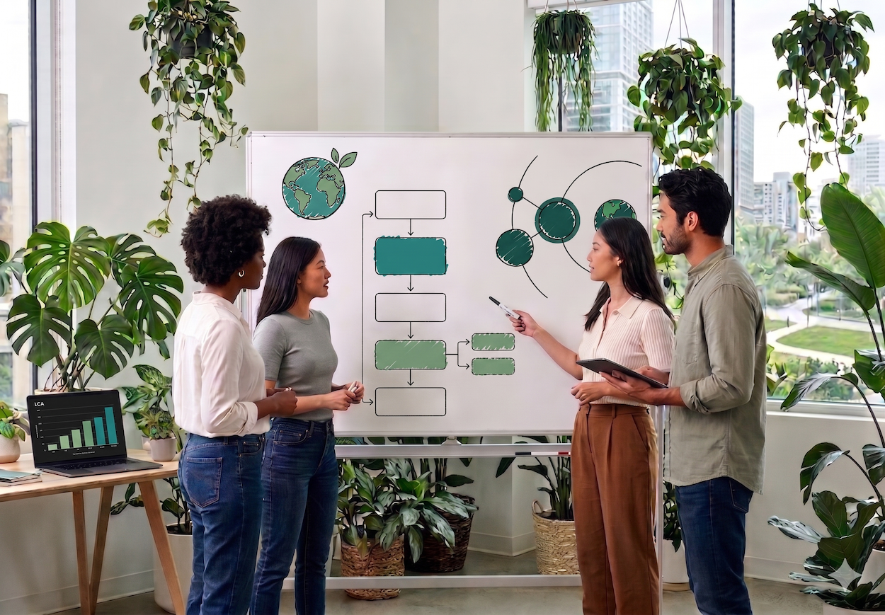
In order to create this accessible utopian product, we based our work frame on keeping humans/users at the centre of everything we do and not just create something that can only be understood by experts! We aimed from the very beginning on creating the exact opposite of what we believe is Fossil LCA, the old way of doing LCA.

We felt the need to prioritize our users over everything else, like sometimes competing business concerns. We are creating a product based on the design thinking principles of Empathy, Definition, Ideation, Design, Prototyping, Testing and Iteration. For all this to be possible, we as a team understand that the time of assuming that we know what our users want and need from our product is long gone, and we now know the best is to actually include them in the conversation from the very beginning.
For example, through our long experience with most LCA platforms, it is very clear to us that these have all been created assuming what the users were looking for, but without actually knowing. Assuming that all users are LCA experts and all they need is a very complicated platform for a once in a product’s lifetime LCA, and not a living LCA. And this, like so many things when designing a product, is a self-fulfilling prophecy.
The end results are platforms that are very hard to use, that mostly look as unappealing as if they belong to the same family as MS-DOS, and on which a product’s cycle is represented by endless lists and forms that feel scary to look at and incredibly hard to navigate. And it’s not that we have anything against MS-DOS or look alikes, but everything has its place.
These platforms very bluntly feel like they were made to be used by machines and not by humans! If we are aiming for deep global environmental awareness, then LCA needs to be easy to use, and feel modern and encouraging so that users actually want to do it.
Although we always had an idea of what we wanted the product to look like, with all the above in mind we started by not assuming we knew our potential users but actually sitting with them. We allowed them to express their struggles with the available platforms and what they would like to see in a new platform so they would even consider moving to something new.
It’s true that we heard a lot of what we had already assumed but, when doing these testing sessions it is difficult but crucial not to influence the user, or ask guiding questions, towards hearing what you want to hear. There were also things we were not aware of but which were hard pain points for the everyday user. And there were also some other points we realized are simply what we like to refer to as non-issues.
For example, visually the aim was to create something as far away from the usual old data lists as possible so, at the beginning we thought of only having the circles view that we currently have, and we got users asking for a "boring view" for exports and the like. So with that in mind we tried to keep the principles but empathize with what they needed.
By talking and getting to know our users, we were able to be a lot more empathetic towards them, to define who they are and what they are looking for from the very beginning.
This also allowed us to ideate in a very clear way, making the formation of ideas and concepts a lot better. This was fundamental to make sure that the UX is as seamless as possible, and that the experience is one of constant reward, both visually and in terms of practicality of using data and getting results in real time.
We didn't think "how can we do LCA a bit better". We thought: what is the most pleasant/fun/endorphin-ridden way of doing LCA. Like playing a video game. Something that is so nice and easy to use that all producers will actually be eager to use, without the thought that either they spend more cash hiring an LCA expert or they just won’t be able to do it at all.

Once the MVP for Earthster had been created we made sure to test, test, and test again. Being so user centric we didn’t just test it in-house but most of the testing was obviously done with real potential users. Again this gave us the best possible insights into all that we had done well but also all that we hadn’t done as the users hoped, all that we thought was needed but actually wasn’t and all that we had simply overlooked. For example, users gave big emphasis to an importing feature, which we wouldn't have given that much importance otherwise.
All the testing made the iteration process much quicker and clearer, in essence it kept us focused on what the users really need. The truth is, we know that Earthster will need constant iteration to be the best version of itself, but that might never be done. There is always something to improve, for someone. That is why we listen to what our users have to say. And yes, I mean you, the reader. We want to talk with you as well!
Summarizing, to develop an amazing experience for your users you need to:
- Begin by building empathy with your users, so you know them and understand their context, needs and problems.
- Don't settle for an ok experience, try to make it the most amazing experience you can possibly imagine.
- Test everything, everything is a worthless assumption unless you have tangible proof.
- Nothing is perfect, you need to keep talking to your users so your product keeps being the best version of itself.
At Earthster we believe that we are paving the way to a brighter future, and creating an experience that every producer will finally want to be part of. And obviously we couldn’t be happier, after all we really are just a bunch of User Experience Fanatics!